Elsevier is a Dutch academic publishing company specializing in scientific, technical, and medical content. Elsevier was founded in 1880 in Amsterdamn, Netherlands.

My Role
User Research
User Interviews
Journey Mapping
Sketching
Wireframing
Screen Flows
Visual Design
Platforms
Web
Year
2018 - 2021
Background
Researchers at institutions need to be able to share the impact metrics of the research their colleagues are publishing. These metrics help their internal stakeholders understand the impact and value their research has as well as the reach their research has to a global audience.
Why is this important? The more information the researcher has about who reads their published research and how it is distributed the better. It helps the university really understand the economic impact they have as well with regard to the funding and grants they may receive on an annual basis
The Problem
Research admins were having trouble being able to pull in all reporting information they needed to report on in one place. They would have to cut and paste compile research into their own word documents from the old dashboard because all the data they needed was not right in front of them. Much of the information in the old dashboard was fragmented, difficult to access or locate. When it came time to share this data the job of compiling and finding research became cumbersome.
My Role
As the only product designer on the team at the time, my role was to lead the entire UX process end to end. I was involved in all phases of the project, from research all the way to finalized product.
My work included user research, product strategy, UX, UI, A/b testing, and delivering the final designs. Ultimately to be the voice for our users and design a new product.
My Tasks
- Un cover user problems with the existing dashboard navigation and layout
- Ideate a new solution based on the user research
- Conduct user interviews for a new solution and validate the new solution
- Make the reporting dashboard easier to use and find the information that was needed
- Redesign a new and improved user reporting dashboard to be delivered to our users
Tools Used
- Miro
- Sketch
- Invision
- Jira
- User Research
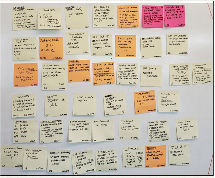
Process Mapping with Users
Using a process map to identify current pitfalls in the workflow.

User Research
Establishing User Goals and Needs Once my research was finished I was able to pair down the main user goals and needs.
Those were:
- Faculty need to demonstrate how impactful their work is easily in the tool.
- Reporting needed for admins is not all in one place. Must be in one place to locate it quickly sufficiently.
- Data is hard to diagnose for internal stakeholders who do not use the system all the time. Therefore they must be able to easily understand what the data is saying with a brief glance.
- The navigation of the old system was antiqued in its layout and not easy to use.
- Update the navigation so users can find what they need.
- Users need to see the real-time effects of research output.
.
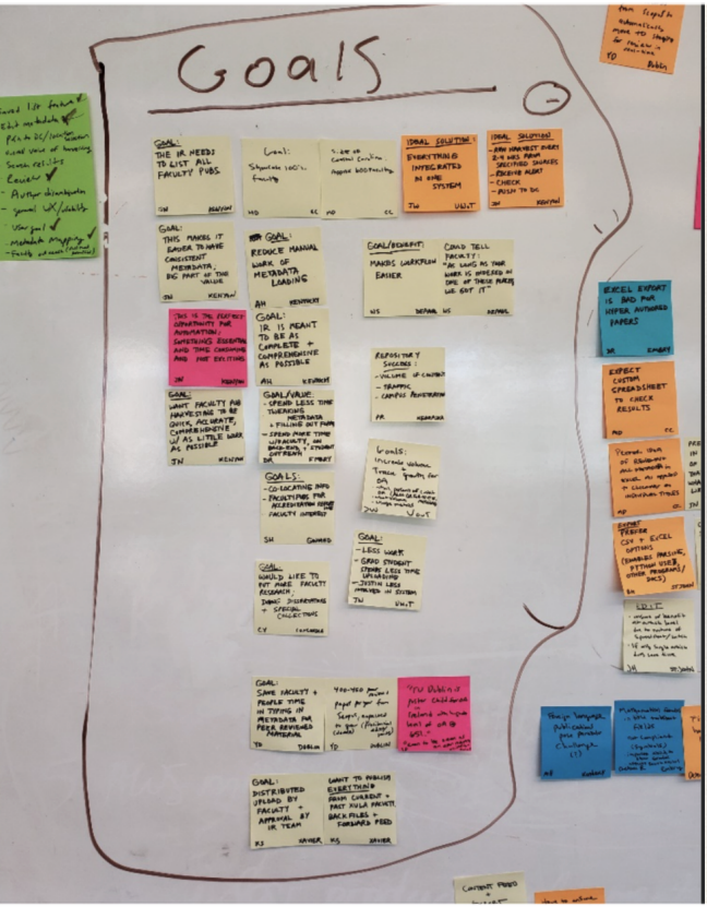
The Persona
To gain a better sense of empathy, I first created and compiled a user persona. This included their bio, challenges, roles and responsibilities, and how many visits they make to our software platform each year. It was important to really understand the user challenges and needs before any design work.

Compile and Sythesize
After several in person interviews I compiled all the research and sythesized my main themes and goals the users needed.
Our Users Spoke
“I need faceted views of impact metrics so that I can provide data for specific departments, collections, authors and disciplines" - Researcher at FSU
“I need access to citation counts so that I can report metric most recognized by senior administration” - Researcher at Wright State
“I need easy access to all my impact metrics in one location so that I can find the data my senior administrators need quickly and easily” - Researcher at University of Miami
Ideating
I like to begin every new product design idea with a simple pencil and paper. This allows me to see it visually and really start to lay out how the product might look and flow for the user.


Wires
At the beginning of my design process, I created wireframes for testing purposes. These were useful in understanding the overall product layout and flow of information. As well as making sure the users could navigate easily through the product. For these tests, I did some simple high-fidelity mock-ups using Sketch.
These were useful in understanding if users had all the information they needed to:
- Find the reporting data they needed
- Navigate the dashboard quickly and sufficiently
- Save and share the reports with both internal and external
- stakeholders
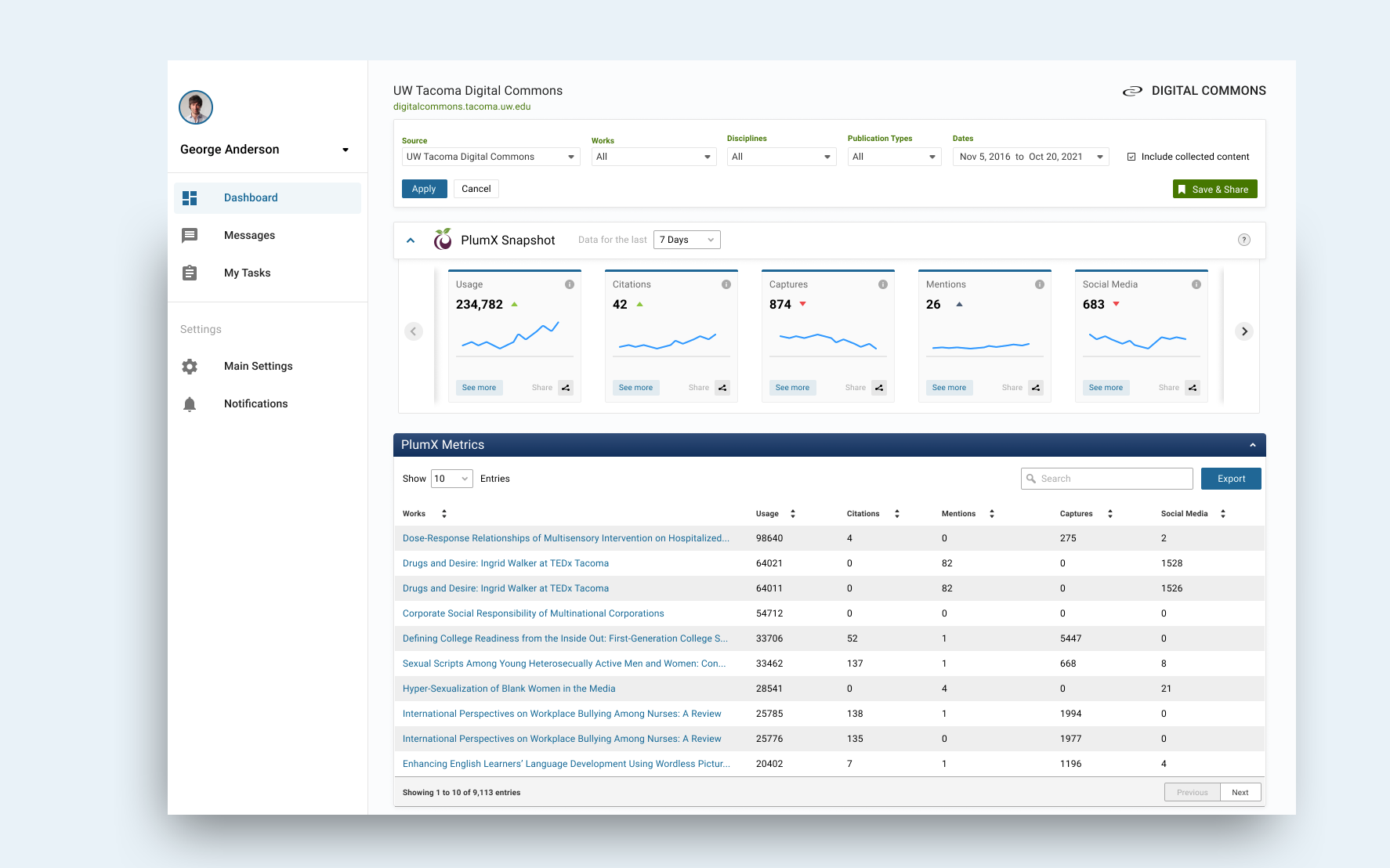
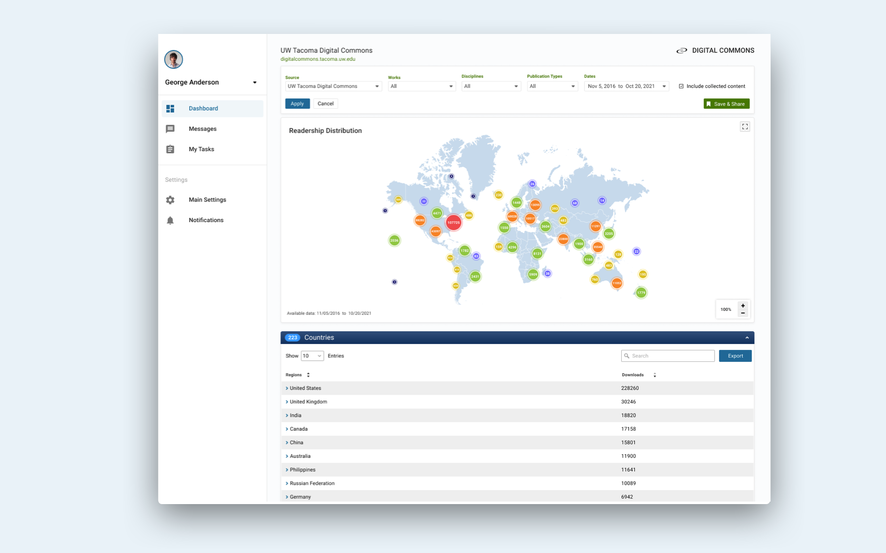
- Access citation counts with a quick glance of the dashboard
- Dig deeper into the impact metrics and the meaning of each
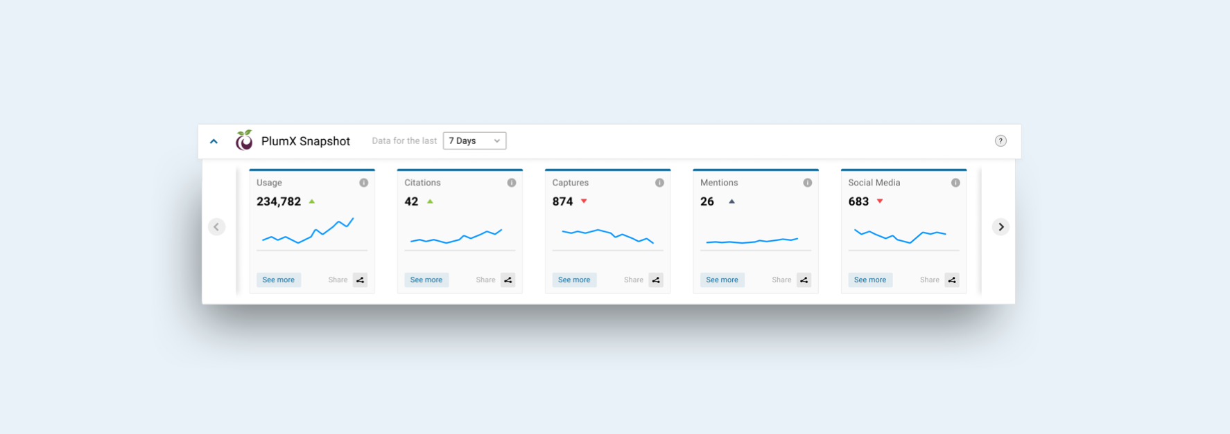
Finalized Prototypes
Before launching the product, I did a testing in virtual user interviews round in order to reveal possible usability problems.

Key results
200k
8
72%
Report Downloads
New Customers
User Engagment
Phone: 310 717 2329
Email: brandonbreon@gmail.com | LinkedIn
Other Work

AXS iOS Mobile AppProject type

Search ProductProject type

Analytics DashboardProject type

StrategyProject type

Ticketing PlatformProject type

Medical DashboardProject type